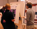
A poster presentation is a method of communication which requires a unique design approach. Your poster is an introduction to your topic and should provide just enough information to spark a conversation between you and your audience. This page will guide you toward making a quality poster capable of grabbing attention and inspiring a quality discussion of your work.
Required Poster Dimensions: 32 inches wide x 40 inches tall
Table of Contents
- Planning and Managing Your Content
- Designing Your Poster
- Fonts
- Colors
- Pictures
- Graphs
- Examples & Tutorials
- Printing
Planning and Managing Your Content
Rule #1: Consider your audience and strive to find the most simple, clear, and catchy way to approach them with your content.Rule #2: Make use of available resources. Creativity is inspired by boundaries, so familiarize yourself with the presentation requirements of the event.
Rule #3: Think of the poster as a conversation starter and keep all of your text concise for impact and readability.
Pictures, graphs, and text should all work together to present your information. Balance is key and white space is a friend, not a foe. In
Designing Your Poster
Create your design on a single PowerPoint slide. This is not the best format for poster layout; however, it is the easiest for beginners to get the hang of and it is easy to print. When you are participating in one of IEL's programs, you must use a IEL Poster Template as a baseline for your design. For otherPeople walk past walls of text. After transferring your content from the word processor to the PowerPoint slide you'll likely find that some adjustments need to be made. Does the content have a natural flow, or is it hard to understand where it begins and where it ends? Is there enough white space? Again, consider simplifying your text. Focus on key points and main ideas, and provide just enough information to prompt your discussion and help you remember your work.
Fonts
People also walk past unprofessional looking text. Use unembellished, legible, and heavy fonts such as Helvetica, Calibri, Arial, etc. If you have so much text that it doesn't fit in the box, shorten the text rather than make it smaller. Don't justify your text like a newspaper, and make sure that hyphenation is disabled, this will make the text more readable. Black type is best, but bold or color can be used to emphasize or highlight key points. Just remember: Your text needs to be legible from 5-6 feet away. Font sizing Suggestions:

- Title: 100-144 points
- Section Headings: 72-84 points
- Main Content: 18-24 points,
double spaced Acknowledgements and References: 10-16 points,single spaced
Colors
Does your area of research have any associated colors? For example, breast cancer is commonly associated with the color pink. Using color correctly will draw people to your presentation, and may draw key people that are already familiar with your discipline or area of interest. You may have noticed that the pink in the sentence above was hard to read, so instead of using pink for your Keep your background white for legibility. (Also: IEL cannot afford to print large blocks of saturated color, and the background of your poster must be white if you intend to print at IEL.)
Pictures
A picture is worth a thousand words, but make sure they speak to your message: Use pictures that strongly communicate something about your work, and use them sparingly for impact. Photographs of your office, laboratory, or field site, or the apparatus you have on your lab bench may also be 
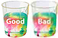
Pictures should be high resolution (between 150dpi and 300dpi) otherwise they may appear blurry when printed on the poster. When taking images from the web, make sure they are high resolution and absolutely do not stretch them to be any larger.


